

RENOVATION OF MAHVIN BEAUTY CLINIC
2023 | Tehran | Atlas Mall
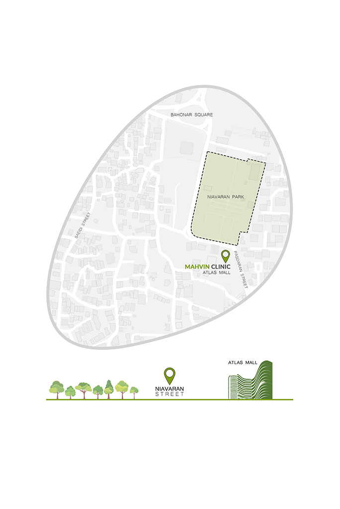
We were given the interior design project of Mahvin Beauty Clinic in the winter of 2023 which is located in Tehran, facing Niavaran Park and inside the Atlas Mall commercial complex. Mehvin is a new brand with far-reaching dreams. Therefore, the architecture and atmosphere of the project could have a significant impact on introducing and forming the personality of this brand and registering it in the minds of the audience.
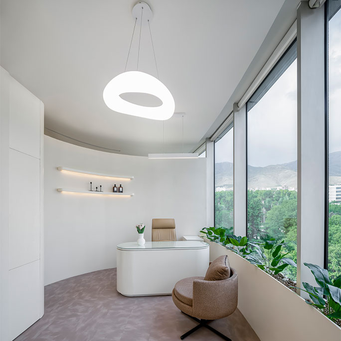
This department was a part of the administrative units of Atlas Mall, which has been in operation for about 4 years. However, the space was important because of its magnificent view of Niavaran Park and Palace, and on the other hand, it was considered a part of the urban landscape. So how to deal with it was important from both sides.
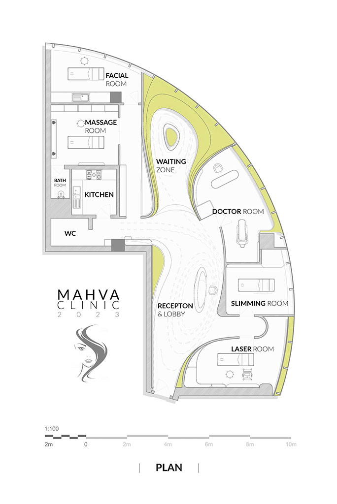
The main challenge we faced in designing the project was that the clinic needed to divide the space into 8 different sections. However, considering the curved shape of the building and the specific lighting needed for each area.
Our design strategy was that, while the architecture of the project should indicate the function inside it, should benefit from the memorable and indicative factor to be registered in the mind of the audience.
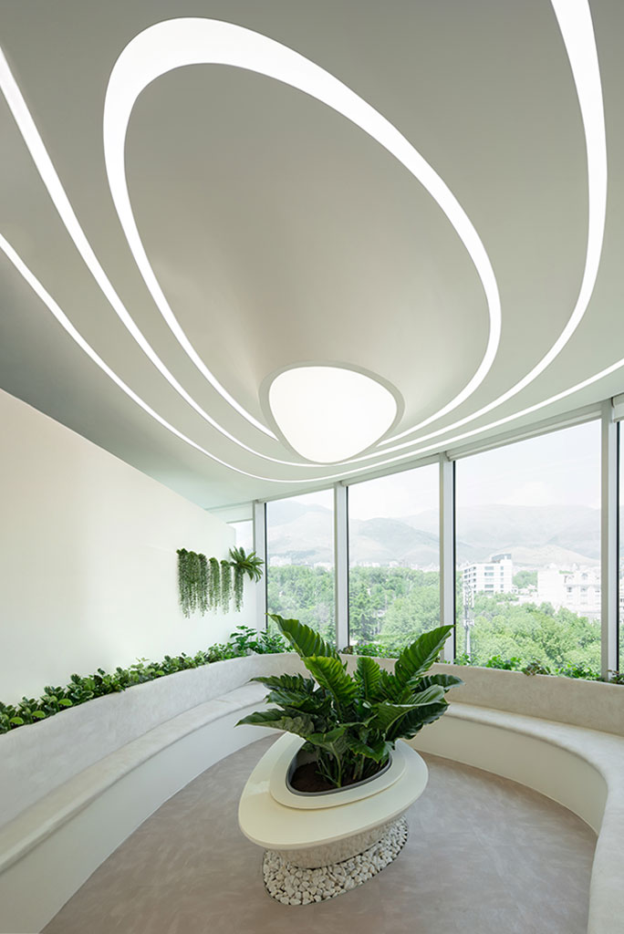
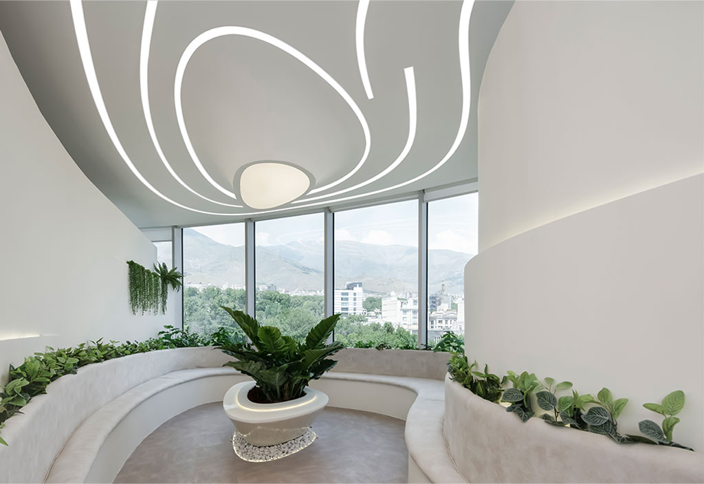
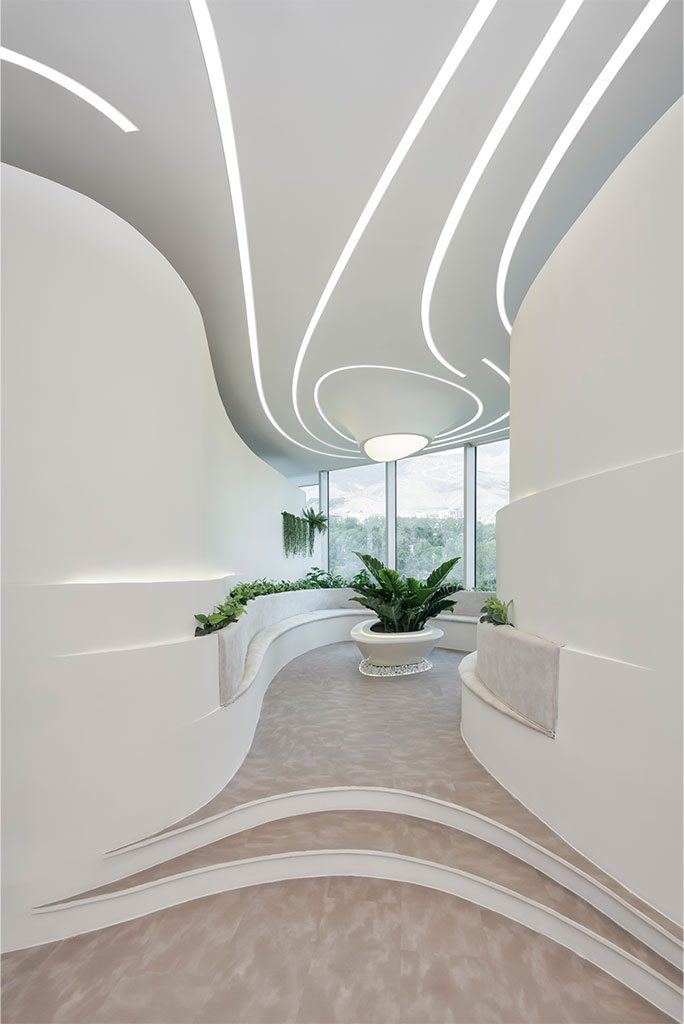
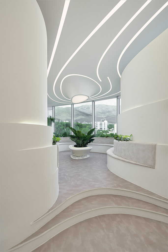
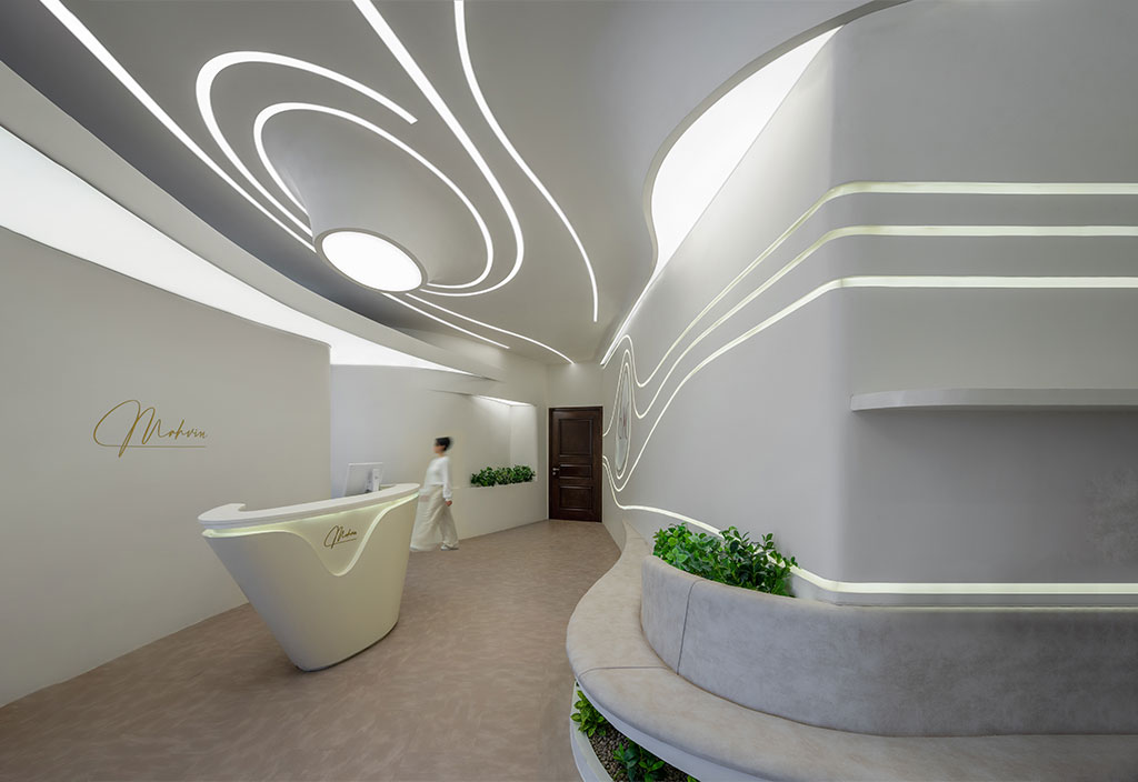
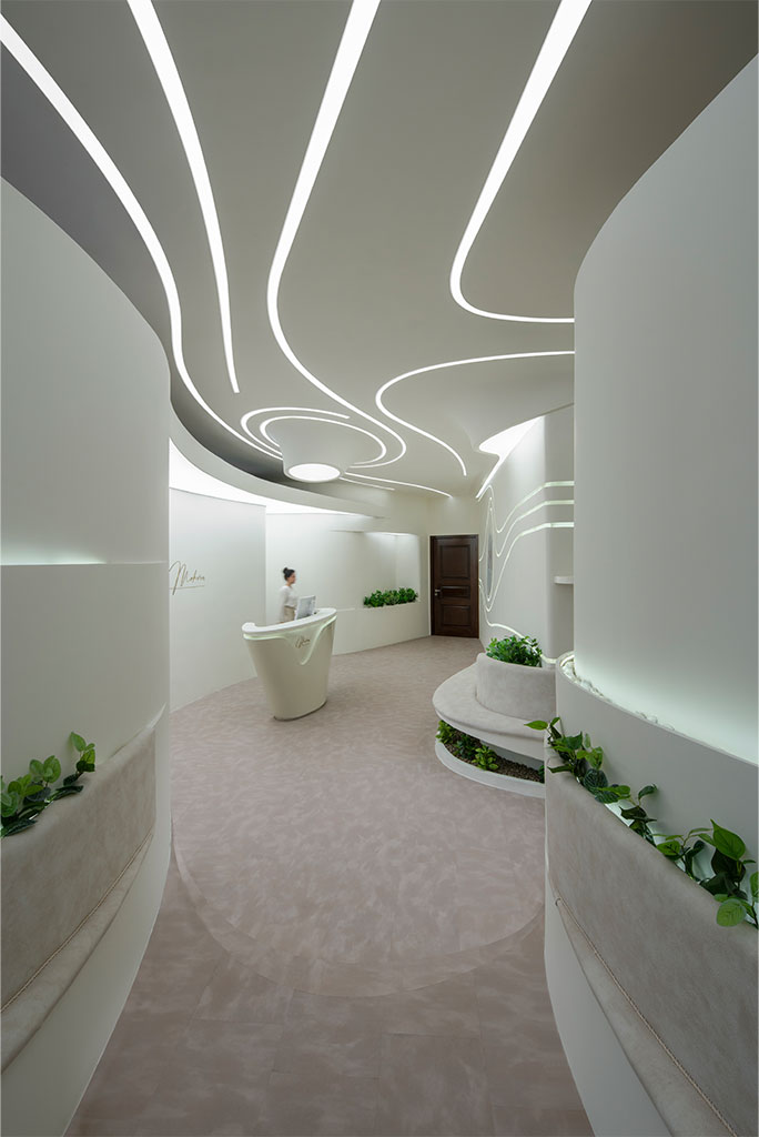
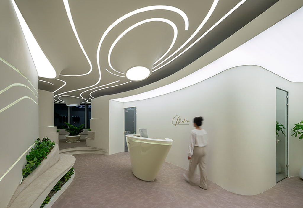
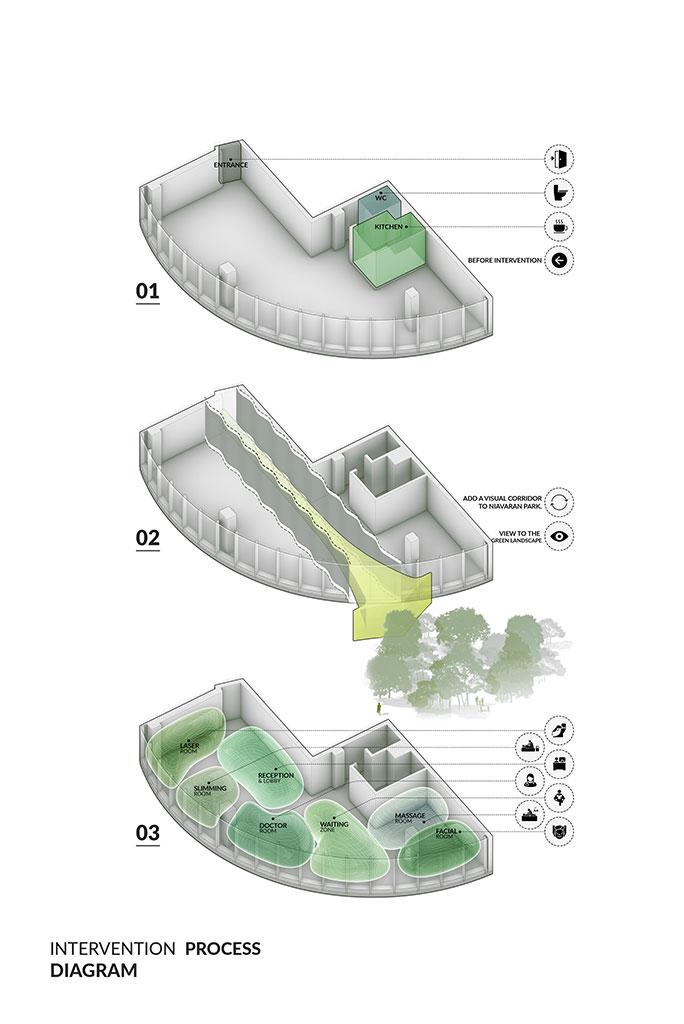
We began the design process by organizing the spaces. we assigned the best spatial quality to the waiting area so that the audience had a more enjoyable experience of being in the space. In order to place the rest of the required functions according to the available space, it seemed that linear organization could be the answer to the problem. Therefore, the creation of an indirect, curved, and adventurous middle corridor could create more suitable access to the waiting area while creating a depth of the square and a wide view of the park and the Niavaran Palace, while providing proper access to the required parts.
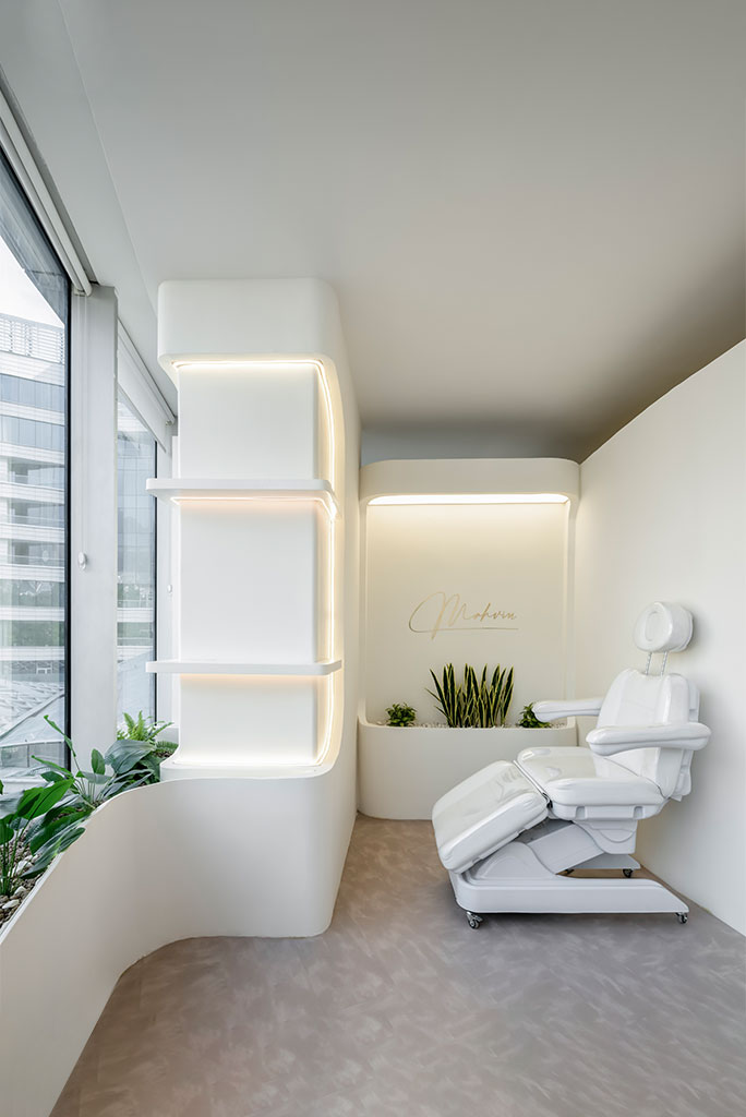
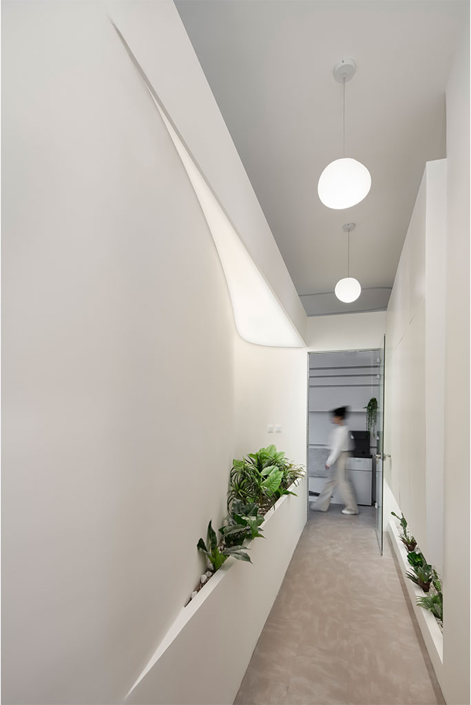
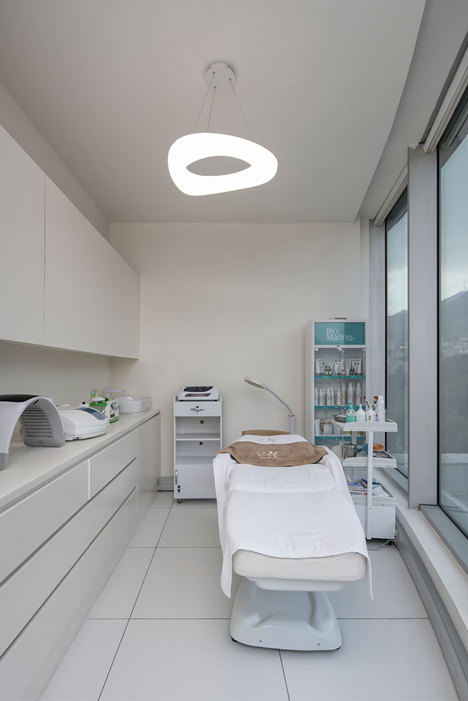
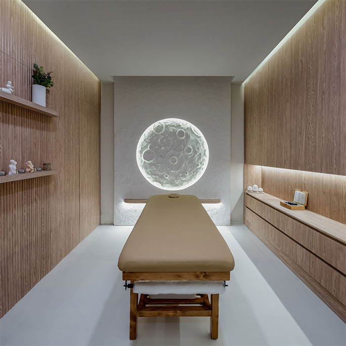
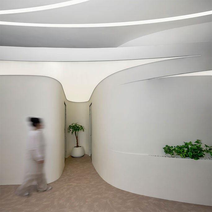
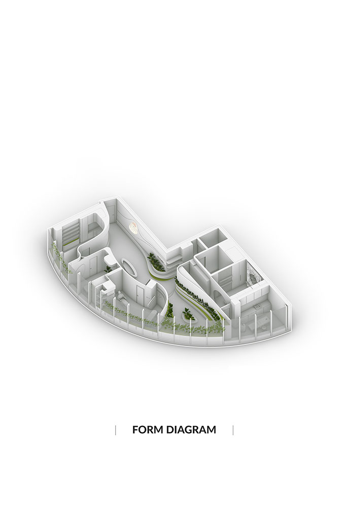
Also, this issue made this path to be considered as a visual continuation of Niavaran Park and its extension into the space. After that, we tried to determine the placement of the spaces in such a way that the functional hierarchy is respected. So the management and examination room were planned near the admission department. The laser and slimming room were also located in a side corridor facing each other. The departments that needed washing space were organized side by side so that the infrastructure needed for them could be provided. According to its needs, we placed the massage room in the darkest part of the space so that it is away from any additional light and sound, and then we placed the facial beauty service room next to the glass partition. At the same time, most of the spaces were not attached to the ceiling, so that while transmitting natural light to the middle corridor, the audience could experience a more continuous and fluid cytoplasm as a whole unit.
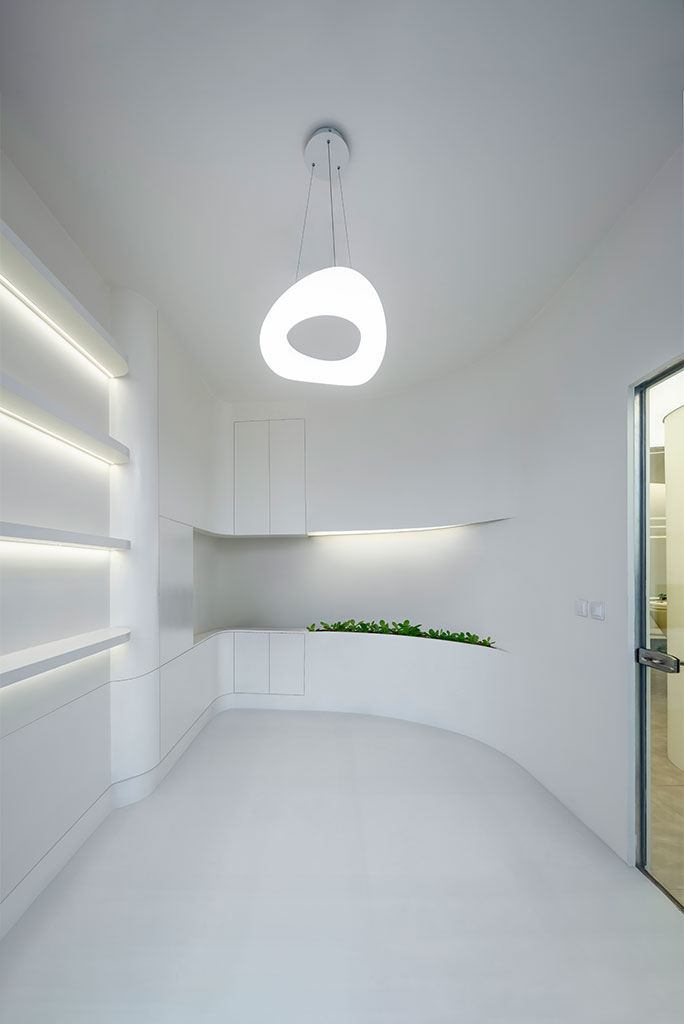
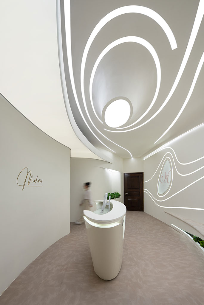
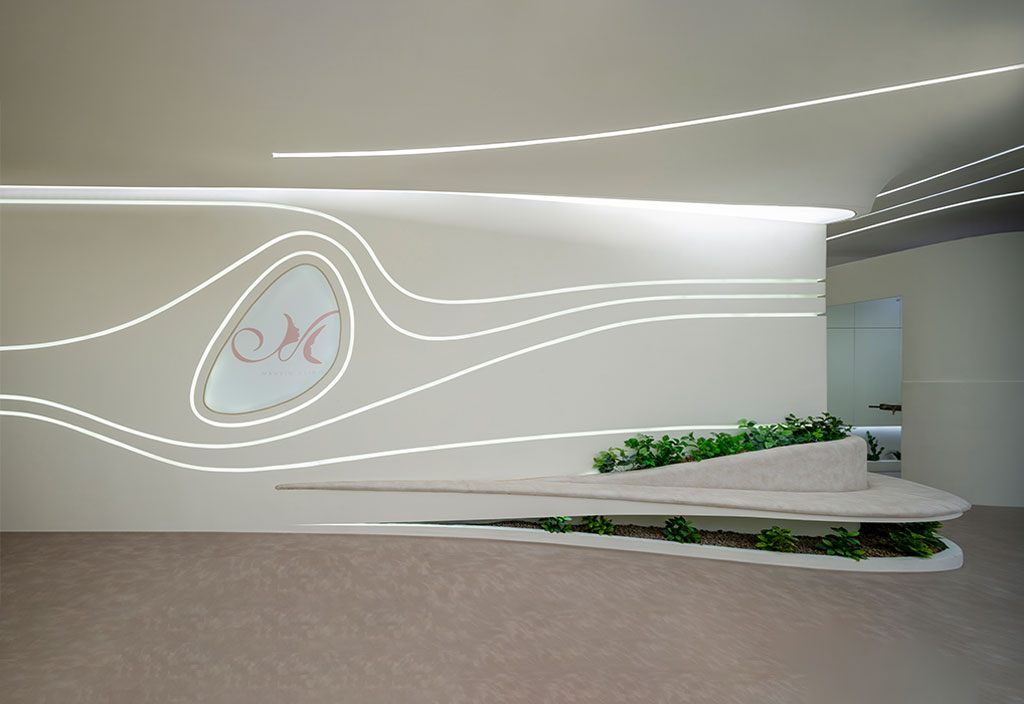
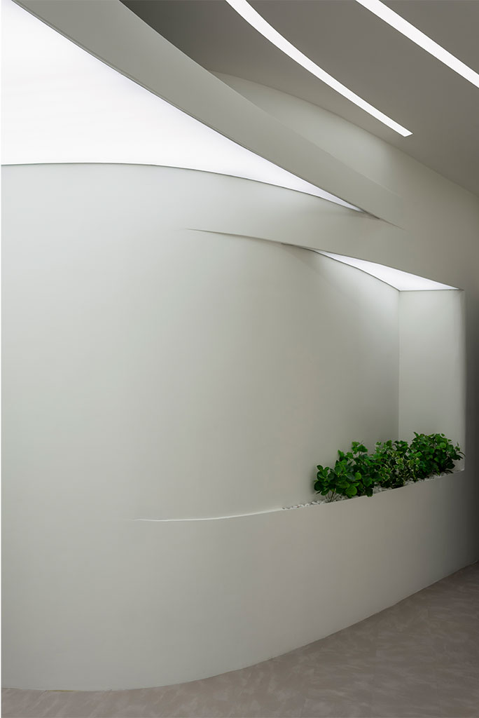
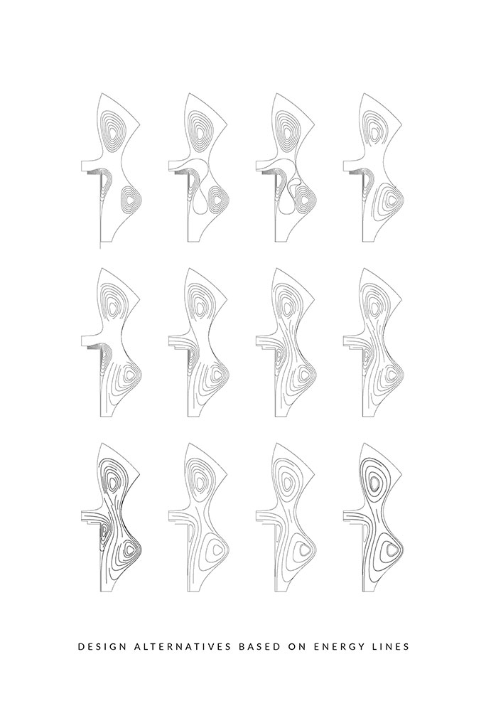
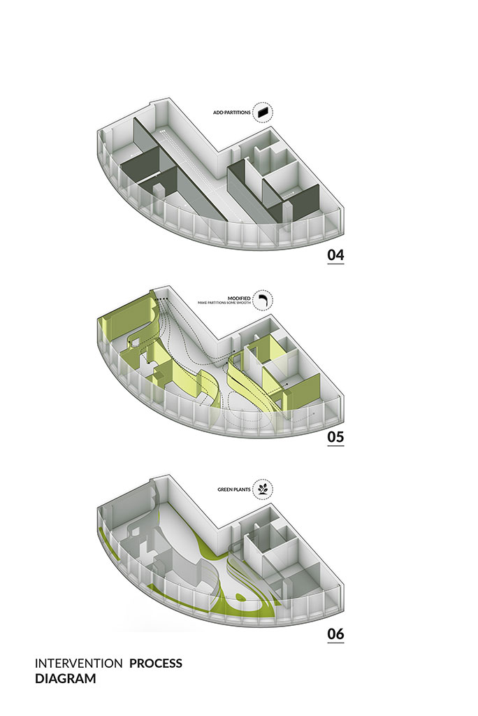
In the polishing phase, an effort was made to make the design literature of the project in such a way that the space represents the activity that happens inside it. Therefore, we were looking for a concept that is a common interface between the function and its internal form. The word "MODIFY" was a concept that was operationally supposed to happen inside this clinic for clients. Therefore, with this tool, we went to the different elements of space. So, like a surgeon with a scalpel, we started to edit the space layer by layer and searched for newer qualities such as the presence of plants, spaces for the audience to sit, and spaces for lighting. The result of this work was the creation of a fluid space, whose components with less definite boundaries and interwoven and continuous were seeking to present a single and integrated personality. A creature that offered a dialectic of simplicity and complexity in form and space to serve the architectural goals of the project and in interaction with its context.
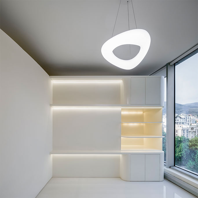
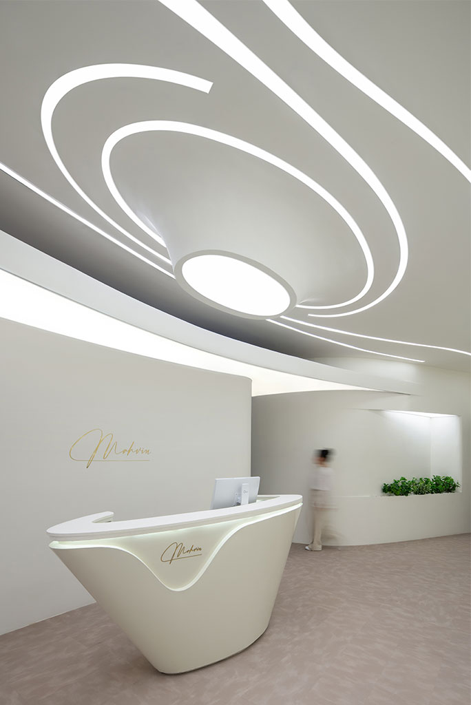
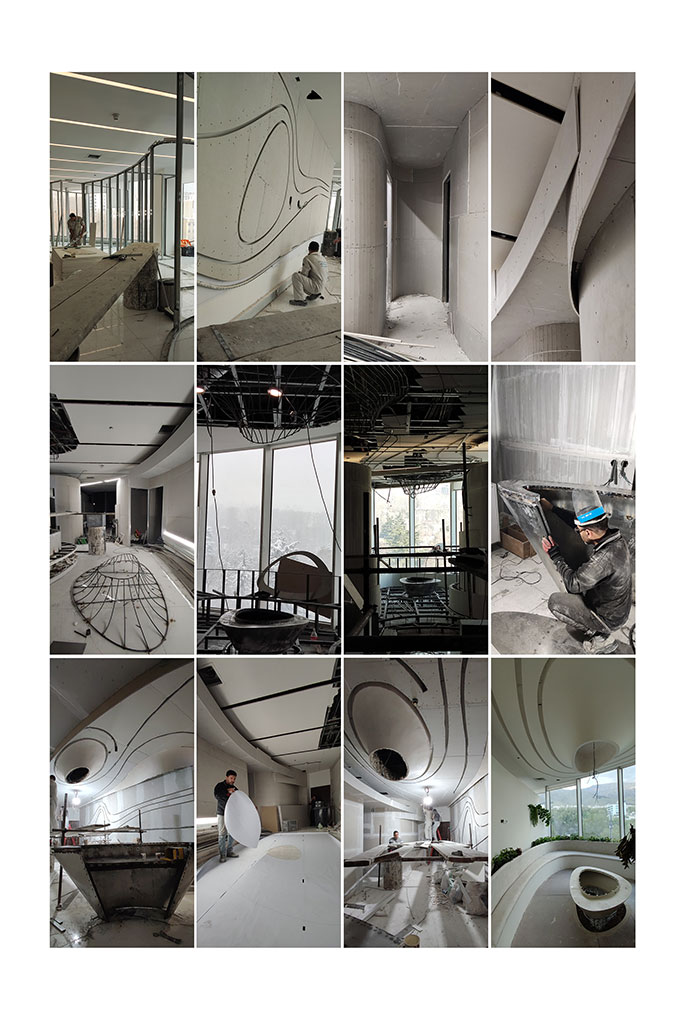
In the construction department, we tried to select the materials used in such a way that they are both economically affordable and technically able to meet the expected spatial qualities. Therefore, in the partition section, plasterboard was used with the Hinge technique, and in the lighting section, we chose the elastic ceiling in order to strengthen the sense of softness and tenderness in the clinic space.
In terms of the color spectrum, the dominant color of the walls was chosen as a light cream color as a metaphor for the color of human skin.
Type: HealthCare
Location: Atlas Mall Complex – in front of Niavaran Park – Tehran
Client: Hiva Tebbe Mahvin
Design and Construction: Hasht Architects
Principal Architects: Shahab Ahmadi - Iman Hedayati
Design Team Manager: Ali Ahmadi
Design team: Ali ahmadi, Niloufar Mohammadzadeh, Mahsa Dorchei, Farnaz agahi
Electrical Facilities: Mega Plus
Mechanical Facilities: Hasht Architects
Area: 170 square meters
Year: 2023
Status: Built