

MELLAT BANK CENTRAL BRANCH
2022 | Tehran | Sepahbodgharani St
Project Definition
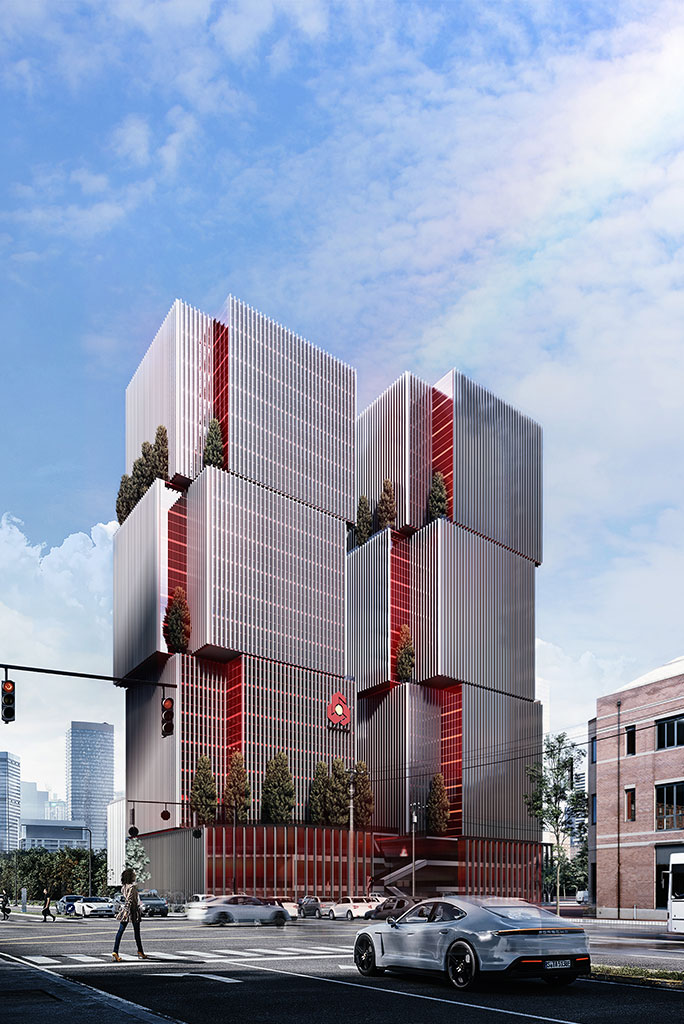
Bank Mellat, as one of the most reliable and leading banking institutions, needs a building that, in addition to presenting its brilliant history, draws bright horizons for the future. While being responsive to functional needs, the project should also be an urban display expressing Bank Mellat's organizational identity, and in addition to being an indicator, it should also establish a proper relationship with its platform.
Opportunities and Challenges
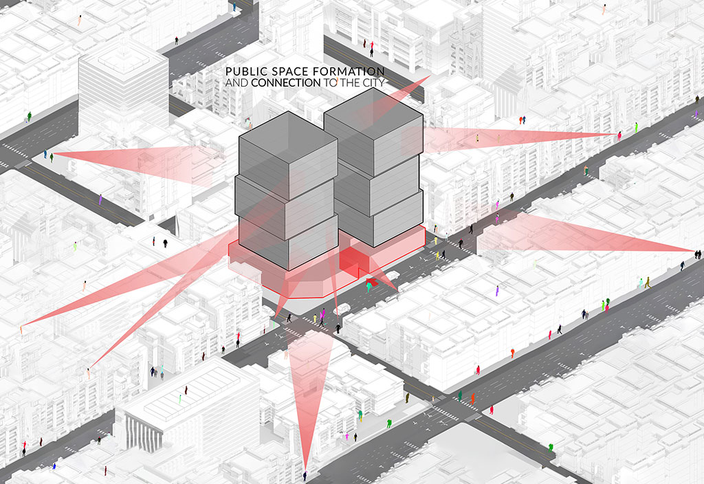
The special urban location of the project site has been freed from all four directions. This issue, while providing the possibility of proper use of natural light, creates a unique opportunity to have a conversation with the city from all sides and a human connection between the city and the bank building.
One of the main challenges of the project according to the national regulations was the occupancy level of 50% and the number of floors approved by the Article 5 Commission. While it is possible to design twin towers, by maintaining the appropriate distance between the towers for greater readability and the possibility of better use of natural light and the urban landscape, and preventing the towers from casting shadows on each other, a suitable answer can be achieved.
Considering the opening of the northern dead end and turning it into an open end according to the opinion of the commission in Article 5 and the placement of the building in an island structure, an opportunity is created to create a free and panoramic view that can influence the design process. On the other hand, the type of density of the building from the bottom to the top requires attention to the connection between different parts and the proper harmony between them, which is one of the important points in the design and communication of the audience with the project on a near and far scale.
Design Strategies
After the initial studies on the book brand, Bank Mellat's slogan, and approach to creating a transformation and a distinct experience for the audience, the overall decisions for the design process can be separated into two general parts. In the structural part, our strategy was that by separating the building into 2 towers and creating an intermediate space, a better dialogue between the building and the city could be provided. Also, paying attention to the medium and close scale in stacking filling, and emptying from the bottom to the top is another important issue that provides a more pleasant experience for the audience. and using the brand book DNA of the collection to provide a sustainable connection with the organizational thinking of the collection.
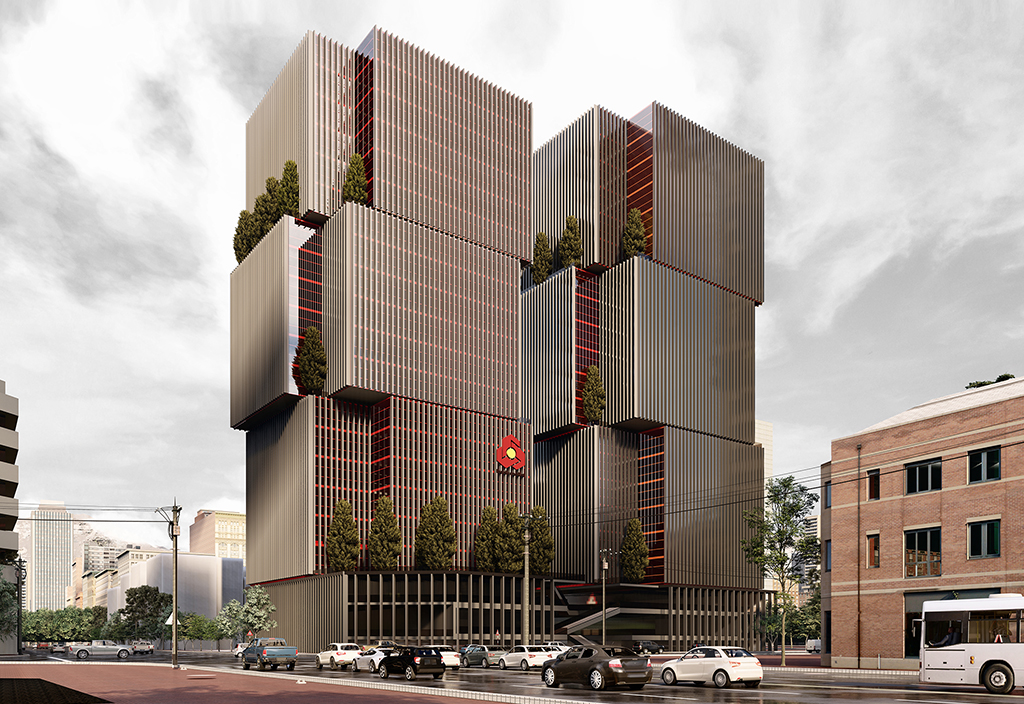
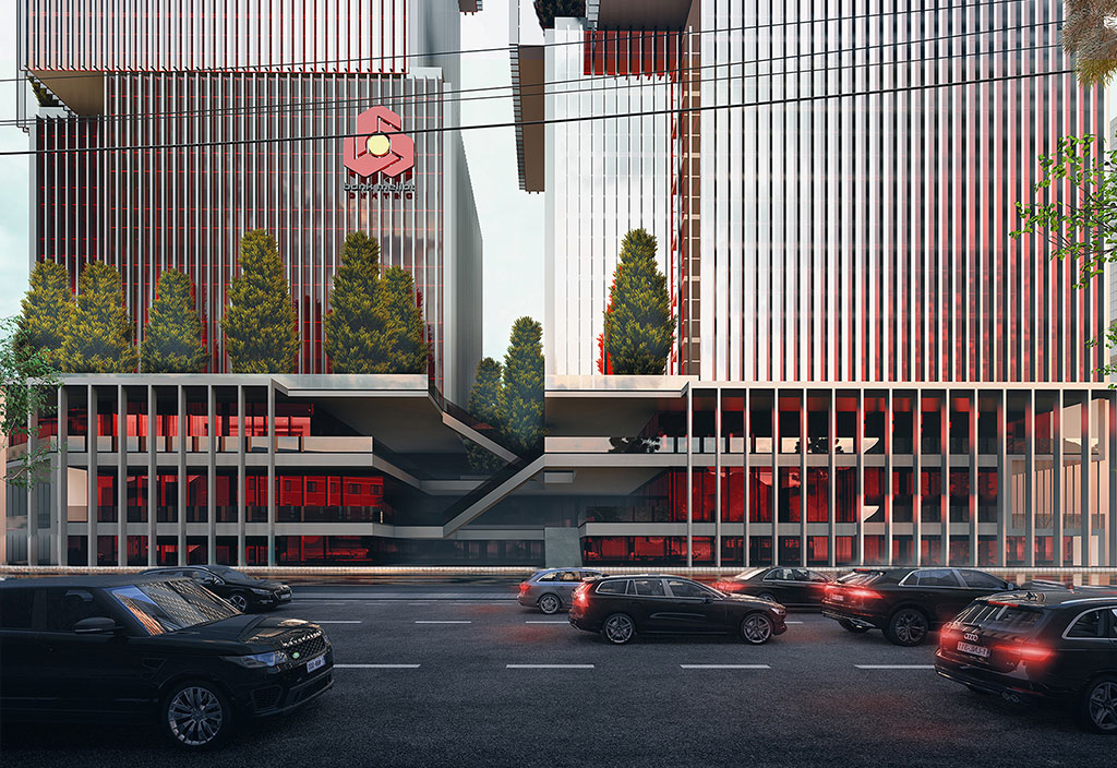
The overall decision for the design of the project was to place the towers at the eastern and western ends to provide the greatest possible distance for their legibility on the one hand, and on the other hand to connect the towers with Iranshahr and Sepahbod Qarni streets from the east and west views. In this way, in addition to each of the towers being placed on the ground, they will be provided with the possibility of independent access. On the other hand, the towers benefit from human vision and scale, which makes it possible to establish communication and contacts, which is a vital issue. On the other hand, the empty space between the two towers penetrates inside the podium and becomes an intermediate space. In the north-south direction, from the middle axis of the project at the ground floor level, where the commercial space is located, it extends to the upper street, thus, in addition to maintaining their character, both towers are combined with the podium and create a single whole that It sincerely draws the city into itself, in other words, this middle space, which has an intermediate quality, directs the flow of life into the project.
Design Process
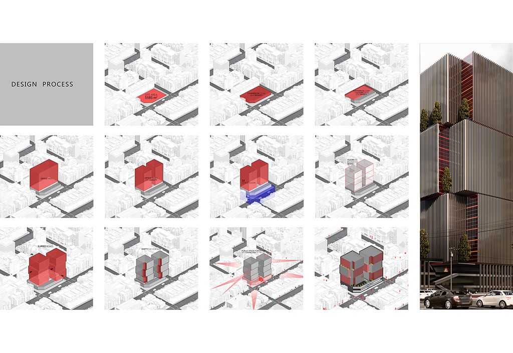
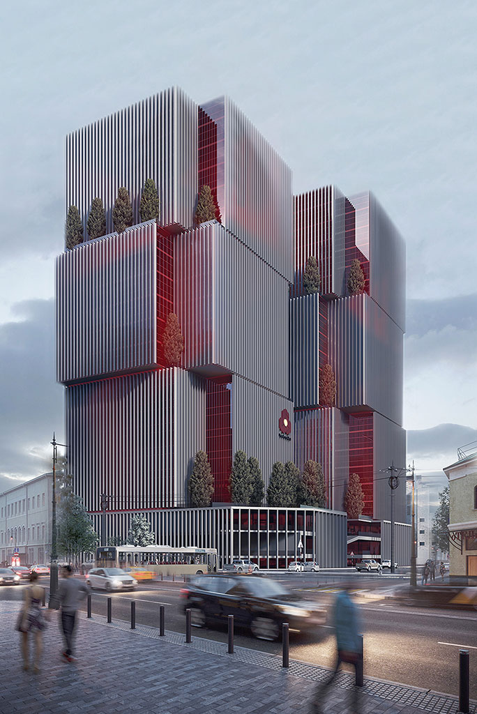
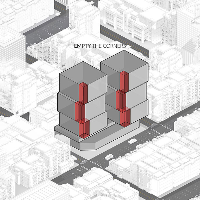
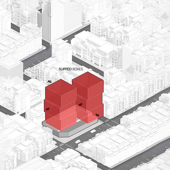
First, based on the square footage in the document and the expected densities, we considered the main structure of the building, which included a wider base at the bottom and a tower with a high height. In the next step, by maintaining the expected density by creating a gap in the middle of the taller tower to a double structure that provided us with more physical potential and spatial qualities. In the next step, we divided the towers into 3 general parts, which slid a little on top of each other, sliding these parts on top of each other provided us with an important possibility.
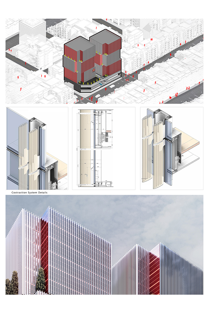
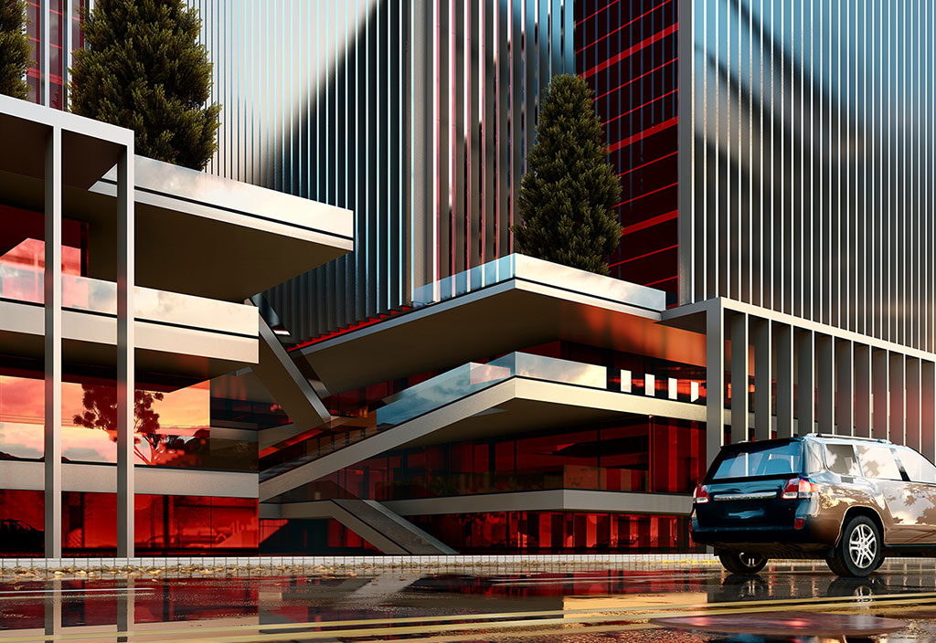
First of all, this quality work created new spaces for us as urban green terraces, which brought more vitality to the living space of the project. The organization of the group was moving in the direction of progress and transformation. In the next section, we came to the lower floors of the project, which established a closer relationship with the audience. In these sections, we tried to create a more dynamic space for understanding and entering the project by creating a multi-level interactive and selective structure so that the audience can experience more different qualities to enter the project. The use of vertical louvres overlooking the project on the one hand controls energy consumption, and on the other hand, by creating a continuous pattern, it provides a distinct experience to the audience from every point of view. And it can carry special messages from a leading and dynamic bank for its audience. At the same time, combining it with the organizational colors of the environmental graphic structure during the project. Creates a meaningful harmony with the brand book of the collection.
In another alternative, we tried to present the same scenario in a different form by horizontally rotating the triple structures on one axis. This time, the terraces play the role of suspension in the middle of the volumes, and in the plan, they benefit from the result of rotations in favor of creating a dynamic and green urban body. In other words, this alternative tries to express the literature of bank building design in a different way with its contemporary state
Type: office
Location: Tehran - Sepahbodgharani St
Client: Mellat Bank
Principle Architects: Reza Sayadian, Sara Kalantari, Shahab Ahmadi, Iman Hedayati, Mohammad Ghaffari
Design Team: Hasht Architects & TDC Office
Graphics: Nilofar Mohammadzadeh, Ali Ahmadi, Mahsa Dorchei
Area: 30,000 square meters
Status: Designed
Date: May 2022