

FACADE DESIGN OF TEHRANPARS COMMERCIAL CENTER
2015 | Tehran | TehranPars
The facade design of the Tehranpars commercial complex was put into limited competition between several companies in November 2015 by Arzesh-Afarinan-Saba. The purpose of holding this competition was to design a beautiful and modern facade, with an easy, quick, and affordable implementation. Our company cooperated as design consultant in this project.
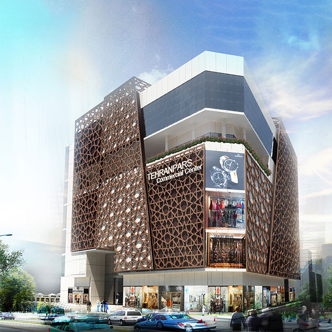
Considering the subject of the competition, it was necessary for this facade to provide visual appeal for a local business project while complying with municipal regulations and technical issues. Placement at the intersection of two streets; The presence of three important facades (including a facade facing the dynamic commercial yard) and finally the existence of full and empty elements in the overall volume of the building (food court terraces) were influential factors in the design.
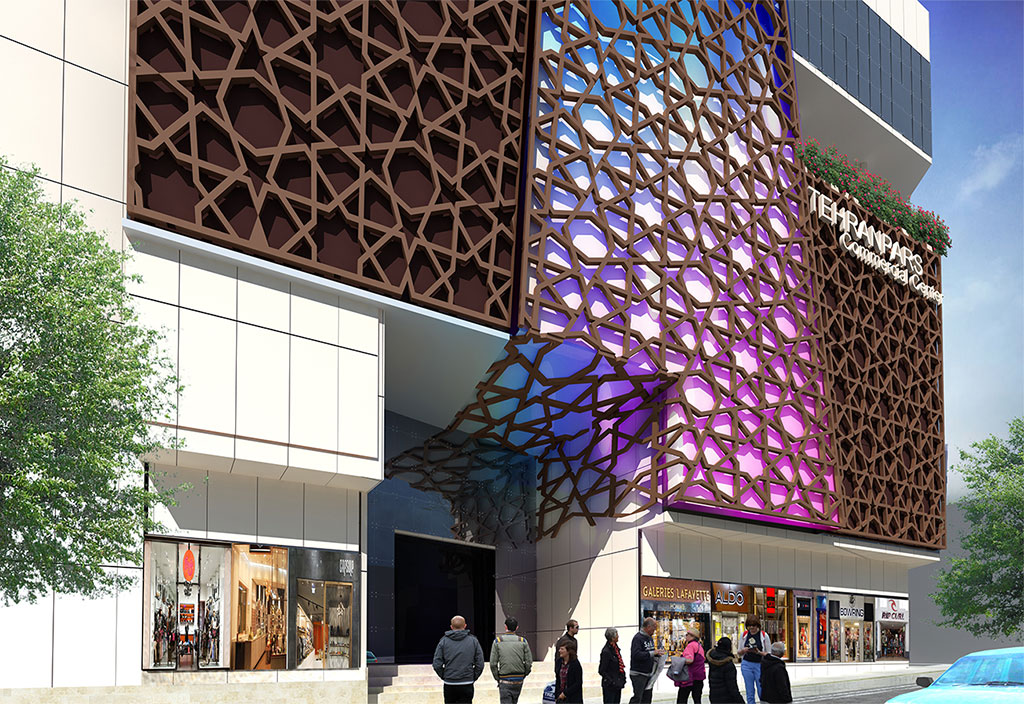
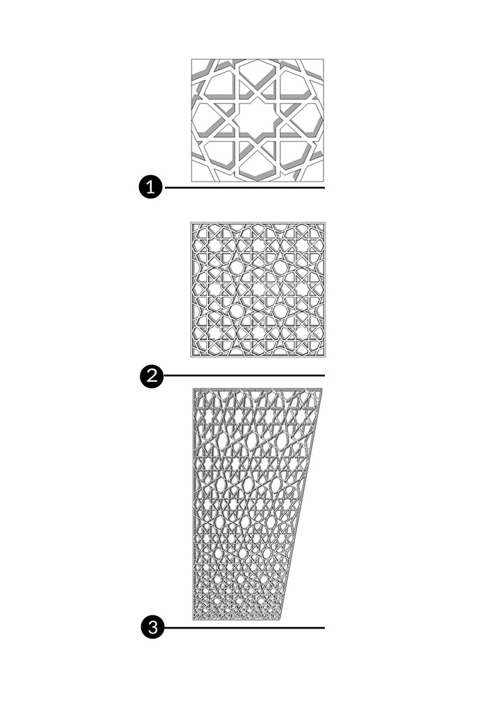
Based on this, the initial idea of this design was formed based on integration and connection between facade elements and different fronts. For this purpose, we considered a shell with a traditional Iranian pattern that, while attractive, offers a different visual quality to the surrounding streets that created a kind of correlation between various and numerous elements of the building by using Iranian motifs along with modernist order and geometry. The definition of the entrance was done by moving the shell and breaking it towards the entrance, thus creating a special visual tension and invitation in this part.
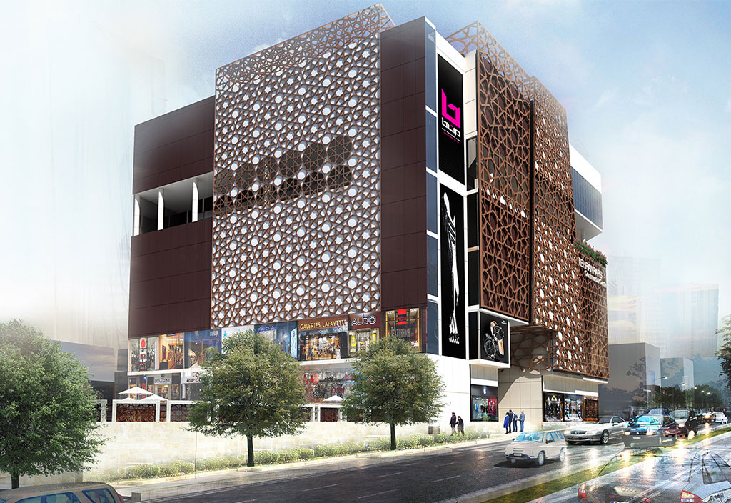
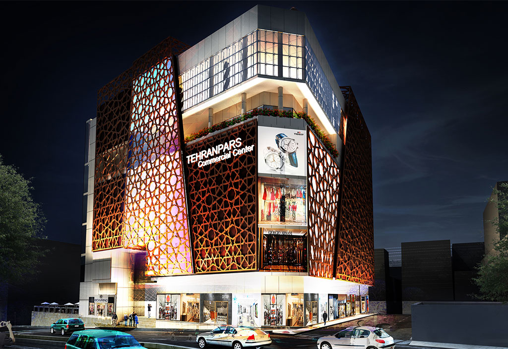
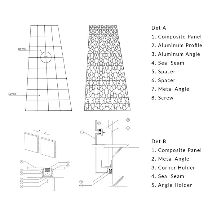
This idea created a kind of correlation between various and numerous elements of the building by using Iranian motifs along with modernist order and geometry. The definition of the entrance was done by moving the shell and breaking it towards the entrance, thus creating a special visual tension and invitation in this part. Paying attention to the micro and macro level for the Audience, far and near, caused us to make the scale of this repeating pattern smaller from top to bottom. The panels containing these motifs were separated from the final level of the building on the two sides facing the street, and thus the possibility of lighting with desired colors was created from behind it. On the side facing the courtyard, however, the designs of Iranian geometry were transferred to the final wall of the building and showed another aspect of our idea. The panels containing these motifs were separated from the final level of the building on the two sides facing the street, and thus the possibility of lighting with desired colors was created from behind it. On the side facing the courtyard, however, the designs of Iranian geometry were transferred to the final wall of the building and showed another aspect of our idea.
In order to meet the functional needs of the complex, in addition to the wall of the ground floor and in some cases the first floor, spaces were also designed in other floors in order to create a "rentable showcase" independent of the store that is located next to it. Also, parts of the facade were considered solid so that all kinds of advertisements can be displayed on them. Finally, with the presence of green space on the facade, especially on the terraces of food carts, the acceptance of people and customers to these spaces was strengthened.
In the design of the facade, the use of the following materials is suggested:
1) A mesh network with slim patterns with aluminum material, which is pre-fabricated in the factory and installed on site.
2) Copper-colored composite plates and Cream composite plates
3) Translucent plexiglass parts: These parts were used in parts of the facade to create the possibility of lighting with a hidden light source and indirectly and the possibility of combining different light spectrums.
Type: Commercial
Location: Tehran – Tehran pars second Square
Client: Arzesh-Afarinan-Saba
Design Team: Hahst architects & Paramadan Consulting Engineers
Status: Designed
Year: 2015